About @react-native-community/progress-view
The npm package "@react-native-community/progress-view" is a powerful tool designed specifically for React Native developers who want to seamlessly implement progress views in their iOS applications. This node module offers a simple yet effective way to display the progress of an ongoing task, such as downloading a file or loading data, enhancing user experience by providing visual feedback. The library is tailored for iOS, ensuring that the progress indicators not only perform well but also match the look and feel of iOS interfaces. By using this package, developers can easily add a polished, native-like progress bar to their applications, which is crucial for keeping users informed about the status of lengthy operations.
Installing the package is straightforward; developers can incorporate the progress view into their projects by running the command npm install @react-native-community/progress-view. Once installed, the module allows for easy customization of the progress bar, including color and size adjustments to fit the design of the app. This customization capability makes it a flexible choice for many developers looking to enhance their app's interactivity. The ease of integration and customization makes this package a preferred choice among React Native developers aiming to improve their app's user interface.
The "@react-native-community/progress-view" module not only enhances aesthetic appeal but also improves the overall user experience by making apps more interactive and responsive. The feedback provided by progress indicators helps prevent user frustration during longer operations by visually communicating the duration and extent of the process. This can lead to increased user satisfaction and retention, as clear communication of app processes keeps users informed and engaged. Moreover, the library is maintained by a community of developers, ensuring it stays up-to-date with the latest React Native releases and iOS updates, providing a reliable and robust solution for implementing progress views in mobile applications.
Dependencies
Core dependencies of this npm package and its dev dependencies.
@babel/core, @babel/runtime, @react-native-community/eslint-config, @types/jest, @types/react, @types/react-native, @types/selenium-webdriver, appium, babel-jest, babel-plugin-module-resolver, eslint, eslint-plugin-ft-flow, flow-bin, jest, metro-react-native-babel-preset, prettier, react, react-native, react-native-macos, react-native-test-app, react-native-windows, react-test-renderer, selenium-appium, selenium-webdriver, typescript
Documentation
A README file for the @react-native-community/progress-view code repository. View Code
@react-native-community/progress-view
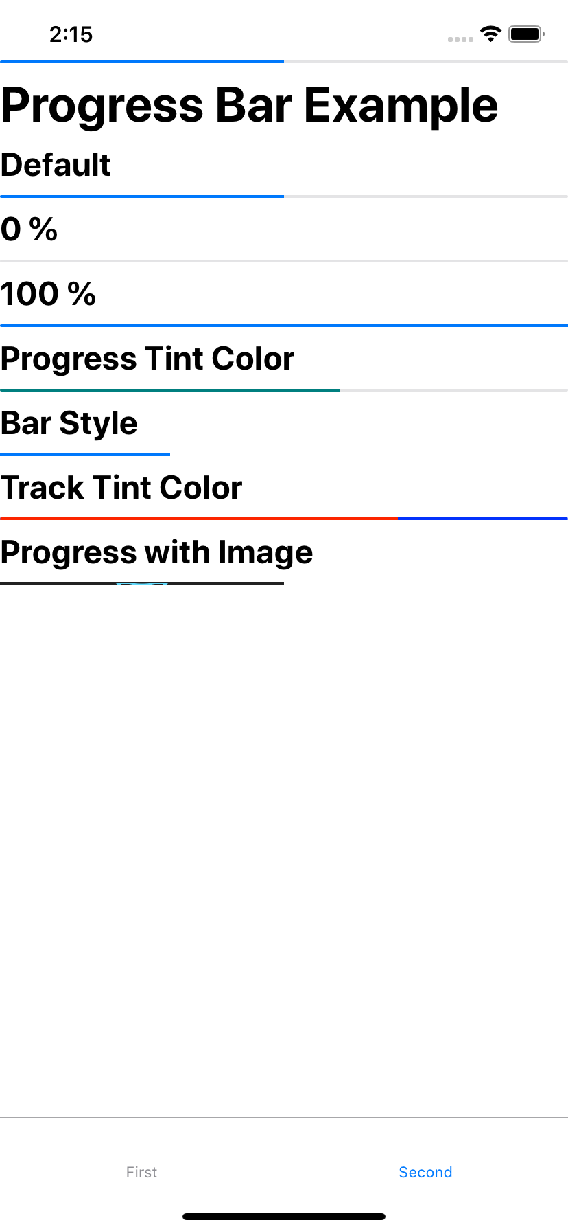
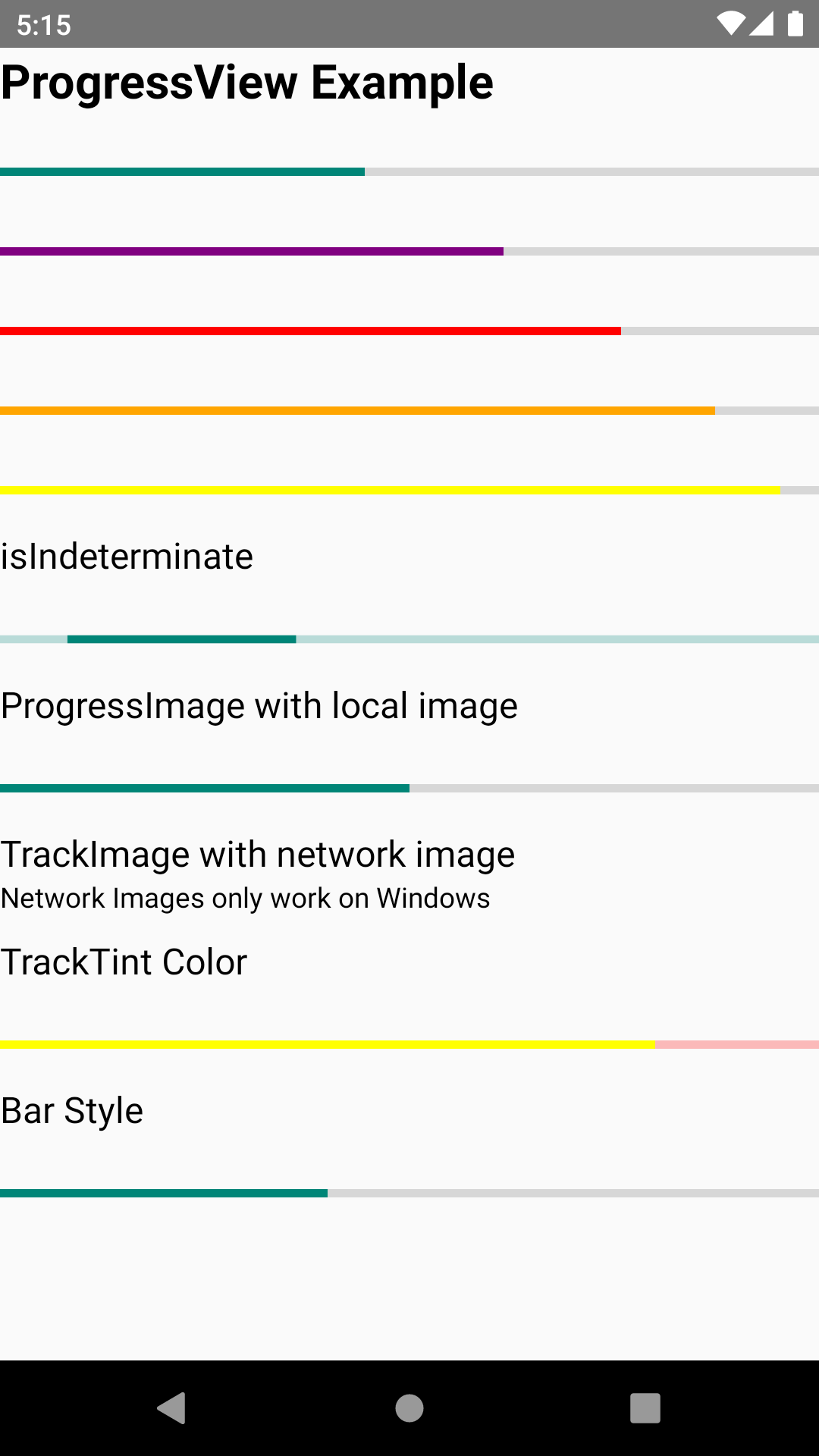
ProgressBar Component for macOS, iOS (based on UIProgressView), Android, and Windows.
| macOS | iOS | Android | Windows |
|---|---|---|---|
 |
 |
 |
 > > |
Getting started
npm install @react-native-community/progress-view --save
or
yarn add @react-native-community/progress-view
Linking
- React Native 0.60+
The package is automatically linked when building the app. All you need to do is:
npx pod-install
- React Native <= 0.59
Run the following commands
react-native link @react-native-community/progress-view
Windows
Add the progress-view project to your solution.
- Open the solution in Visual Studio 2019
- Right-click Solution icon in Solution Explorer > Add > Existing Project
Select
node_modules\@react-native-community\progress-view\windows\progress-view\progress-view.vcxproj
windows/myapp.sln
Add a reference to progress-view to your main application project. From Visual Studio 2019:
Right-click main application project > Add > Reference...
Check progress-view from Solution Projects.
pch.h
Add #include "winrt/progress_view.h".
app.cpp
Add PackageProviders().Append(winrt::progress_view::ReactPackageProvider()); before InitializeComponent();.
Manual installation
IOS
Manually linking the library - iOS
- In XCode, in the project navigator, right click
Libraries➜Add Files to [your project's name] - Go to
node_modules➜@react-native-community/progress-viewand addRNCProgressView.xcodeproj - In XCode, in the project navigator, select your project. Add
libRNCProgressView.ato your project'sBuild Phases➜Link Binary With Libraries - Run your project (
Cmd+R)
Usage
Import ProgressView from @react-native-community/progress-view
import {ProgressView} from "@react-native-community/progress-view";
Add ProgressView like this
<ProgressView
          progressTintColor="orange"
          trackTintColor="blue"
          progress={0.7}
/>
Running Example App
Windows
- Clone branch
- cd into progress_view and run
yarn install - Start metro server with
yarn start:windows - Open Visual Studios and open
example/windows/ProgressViewExample.sln - Set to Debug x64 and start solution
IOS
- Clone branch
- cd into progress-view and run
yarn install - cd into example/ios and run
pod install - cd back into progress-view and run
yarn ios
macOS
- Clone branch
- cd into progress-view and run
yarn install - cd into example/macos/example/macos and run
pod install - Open the newly created example.xcworkspace in Xcode, build, and run
Reference
Props
Reference
Props
progress
The progress value (between 0 and 1).
| Type | Required |
|---|---|
| number | No |
progressImage
A stretchable image to display as the progress bar.
| Type | Required |
|---|---|
| Image.propTypes.source | No |
progressTintColor
The tint color of the progress bar itself.
| Type | Required |
|---|---|
| string | No |
progressViewStyle
The progress bar style. Network images only work on Windows.
| Type | Required |
|---|---|
| enum('default', 'bar') | No |
trackImage
A stretchable image to display behind the progress bar. Network images only work on Windows.
| Type | Required |
|---|---|
| Image.propTypes.source | No |
trackTintColor
The tint color of the progress bar track.
| Type | Required |
|---|---|
| string | No |
isIndeterminate
Turns progress bar into an indeterminate progress bar
| Type | Required | Platform |
|---|---|---|
| bool | No | Windows |
Contributors
License
The library is released under the MIT license. For more information see LICENSE.


