About react-native-raw-bottom-sheet
The npm package react-native-raw-bottom-sheet revolutionizes the flexibility and ease of implementing customizable bottom sheets in your React Native applications. This powerful module is designed to enhance the user interface by allowing developers to add any component to the bottom sheet, catering both to Android and iOS platforms. The react-native-raw-bottom-sheet is perfect for those seeking to create highly interactive, engaging, and aesthetically pleasing mobile apps. With this package, developers can easily integrate a variety of elements such as navigation menus, filters, or even forms into the bottom sheet, making it a versatile tool for improving app functionality and user experience.
To get started with enhancing your mobile application, you can use the command 'npm install react-native-raw-bottom-sheet'. This simple installation process integrates seamlessly into your existing React Native project, setting you up for quick and efficient development. Once installed, the react-native-raw-bottom-sheet allows for the customization of the bottom sheet's appearance and behavior, providing hooks and options to control aspects like height, animation, and visibility. This level of customization ensures that the bottom sheet can be tailored to fit the specific needs and style of your application, enhancing overall user engagement.
The latest release, version 3 of react-native-raw-bottom-sheet, introduces a significant upgrade with the inclusion of functional components. This update marks a pivotal improvement, especially for developers transitioning from version 2, as it supports the modern React component architecture. By adopting functional components, the package ensures better performance, enhanced code readability, and easier maintenance. Developers can now leverage hooks and other advanced features of React Native, which align perfectly with the contemporary trends in mobile development. This makes react-native-raw-bottom-sheet an essential tool for developers aiming to stay at the forefront of mobile technology and design trends.
Dependencies
Core dependencies of this npm package and its dev dependencies.
@babel/core, @babel/preset-env, @react-native/eslint-config, @react-native/typescript-config, @testing-library/react-native, babel-jest, eslint, jest, metro-react-native-babel-preset, prettier, react, react-native, react-test-renderer, typescript
Documentation
A README file for the react-native-raw-bottom-sheet code repository. View Code
react-native-raw-bottom-sheet
Hooray! The new version 3 has been released.
Please pay close attention if you are upgrading the RBSheet from version 2 to version 3.
- Functional Components: Starting from v3.0.0, RBSheet has been completely rewritten using Functional Components. This improves performance and aligns with modern React practices.
- Prop Removal & Renaming: Several props have been removed and renamed for improved clarity and maintainability. Please refer to the updated documentation for a complete list of available props and their intended behavior.


- Super Lightweight Component
- Add Your Own Component To Bottom Sheet
- Customize Whatever You Like
- Support Drag Down Gesture
- Support All Orientations
- Support Both Android And iOS
- Smooth Animation
- Zero Configuration
- Zero dependency
- Millions of Downloads
| Showcase iOS | Showcase Android |
|---|---|
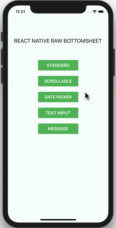 |
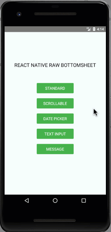 |
Installation
npm i react-native-raw-bottom-sheet --save
or
yarn add react-native-raw-bottom-sheet
Example
Please check the example folder to explore more example codes.
Single Bottom Sheet
import React, {useRef} from 'react';
import {View, Button} from 'react-native';
import RBSheet from 'react-native-raw-bottom-sheet';

export default function Example() {
  const refRBSheet = useRef();

  return (
    <View style={{flex: 1}}>
      <Button
        title="OPEN BOTTOM SHEET"
        onPress={() => refRBSheet.current.open()}
      />
      <RBSheet
        ref={refRBSheet}
        useNativeDriver={true}
        customStyles={{
          wrapper: {
            backgroundColor: 'transparent',
          },
          draggableIcon: {
            backgroundColor: '#000',
          },
        }}
        customModalProps={{
          animationType: 'slide',
          statusBarTranslucent: true,
        }}
        customAvoidingViewProps={{
          enabled: false,
        }}>
        <YourOwnComponent />
      </RBSheet>
    </View>
  );
}
Multiple Bottom Sheet
const refRBSheet = useRef([]);

const renderItem = ({item, index}) => {
  return (
    <View>
      <TouchableOpacity
        style={styles.button}
        onPress={() => refRBSheet.current[index].open()}>
        <Text style={styles.buttonText}>ITEM {item + 1}</Text>
      </TouchableOpacity>

      <RBSheet ref={ref => (refRBSheet.current[index] = ref)}>
        <View style={styles.bottomSheetContainer}>
          <Text style={styles.bottomSheetText}>I AM ITEM {item + 1}</Text>
        </View>
      </RBSheet>
    </View>
  );
};
Props
| Props | Type | Description | Default |
|---|---|---|---|
| height | number | The height of bottom sheet. | 260 |
| openDuration | number | Duration of the animation when opening bottom sheet. | 300 (ms) |
| closeDuration | number | Duration of the animation when closing bottom sheet. | 200 (ms) |
| closeOnPressMask | boolean | Press the outside area (mask) to close bottom sheet. | true |
| closeOnPressBack | boolean | Press hardware back android to close bottom sheet (Android only). | false |
| draggable | boolean | Enable the drag-down gesture to close the bottom sheet. | false |
| dragOnContent | boolean | The draggable is only worked on the draggable icon. Set this to trueif you want to drag on the content as well (doesn't work with ScrollView). |
false |
| useNativeDriver | boolean | Use the native driver to run smoother animation. | false |
| customStyles | object | Add custom styles to bottom sheet. | {} |
| customModalProps | object | Add custom props to modal. | {} |
| customAvoidingViewProps | object | Add custom props to KeyboardAvoidingView. | {} |
| onOpen | function | Callback function that will be called after the bottom sheet has been opened. | null |
| onClose | function | Callback function that will be called after the bottom sheet has been closed. | null |
Available Custom Style
customStyles: {
  wrapper: {...}, // The Root of component (Change the mask's background color here).
  container: {...}, // The Container of bottom sheet (The animated view that contains your component).
  draggableIcon: {...} // The style of Draggable Icon (If you set `draggable` to `true`).
}
Methods
| Method Name | Description | Usage |
|---|---|---|
| open | The method to open bottom sheet. | refRBSheet.current.open() |
| close | The method to close bottom sheet. | refRBSheet.current.close() |
CONTRIBUTING
I'm really glad you're reading this, because we need volunteer developers to help bring this project to life.
How to contribute:
- Clone this repository
- Open project, then run
yarnto install devDependencies - Add your magic code for contribution
- Test your code
- Navigate to
examplefolder - Run
yarn&yarn startto run the example project - Test your code in
example/App.js
- Navigate to
- Update
README.mdto update documentation (Optional) - Write unit testing in
__tests__folder (Optional) - Update
index.d.tsto update typing (Optional) - Make a pull request, Genius!
License
This project is licensed under the MIT License - see the LICENSE.md file for details.
Author
Made with ❤️ by NY Samnang.